Student Assignment
2022
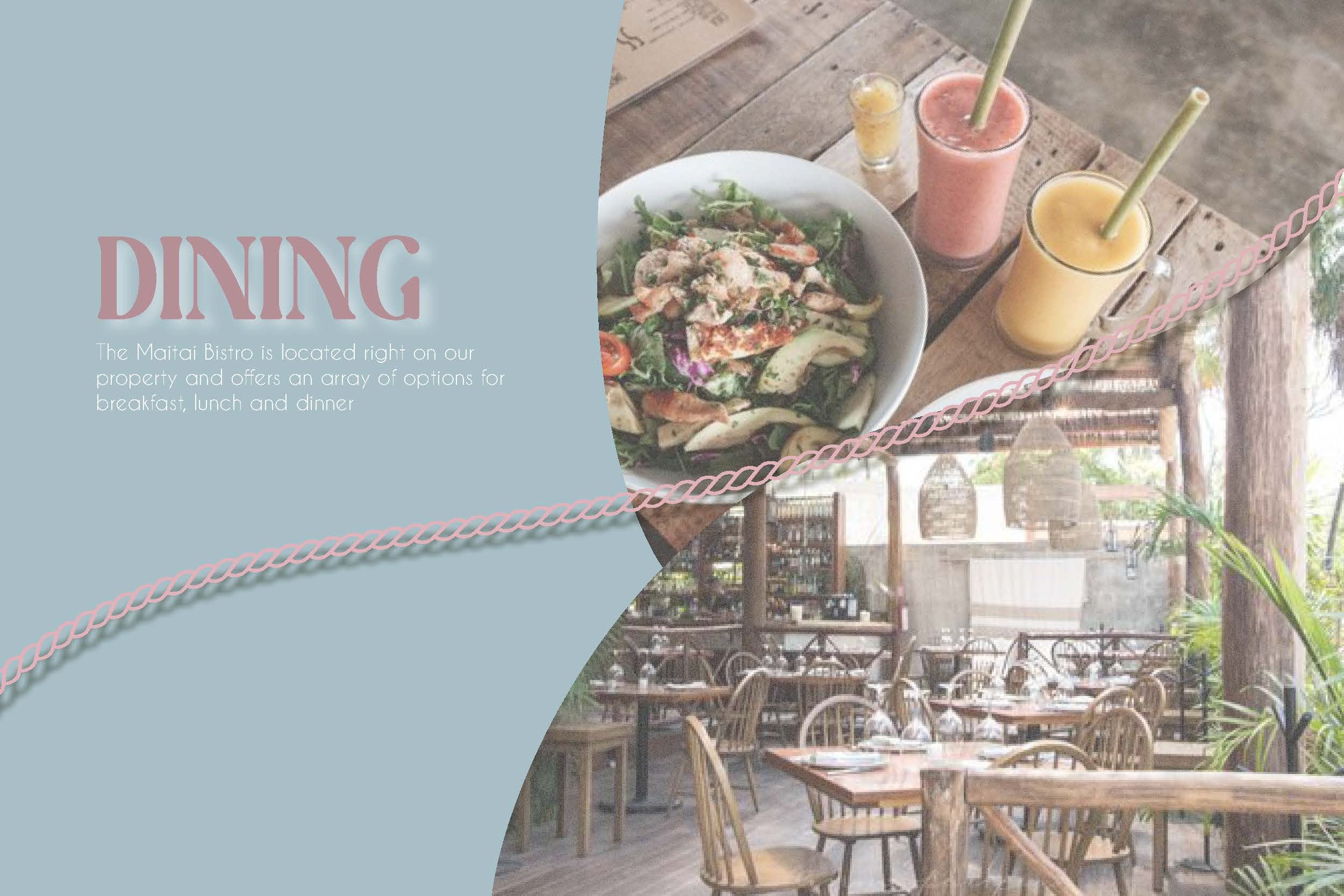
The Assignment: Create branding and an e-brochure for a fictional hotel/hostel.
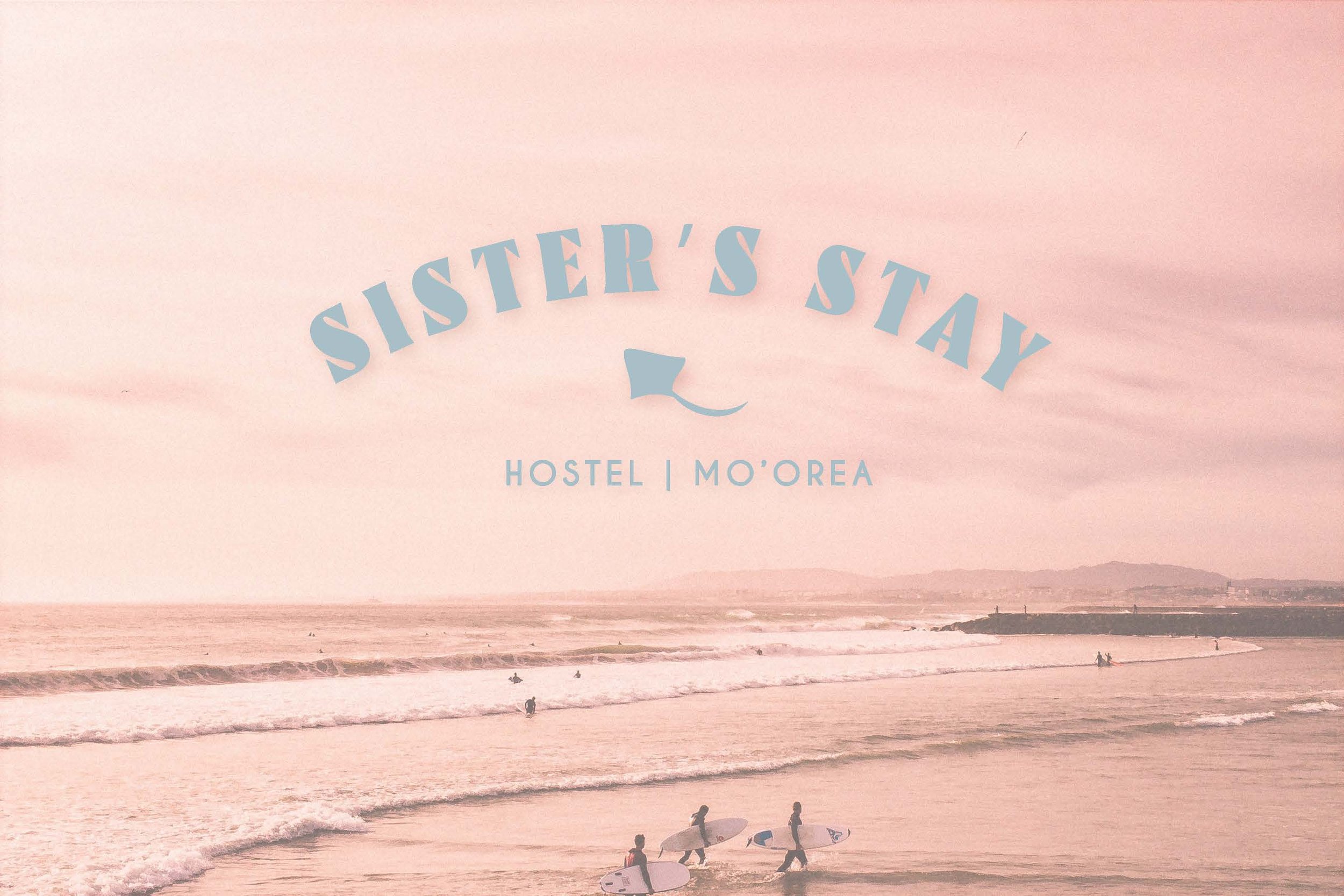
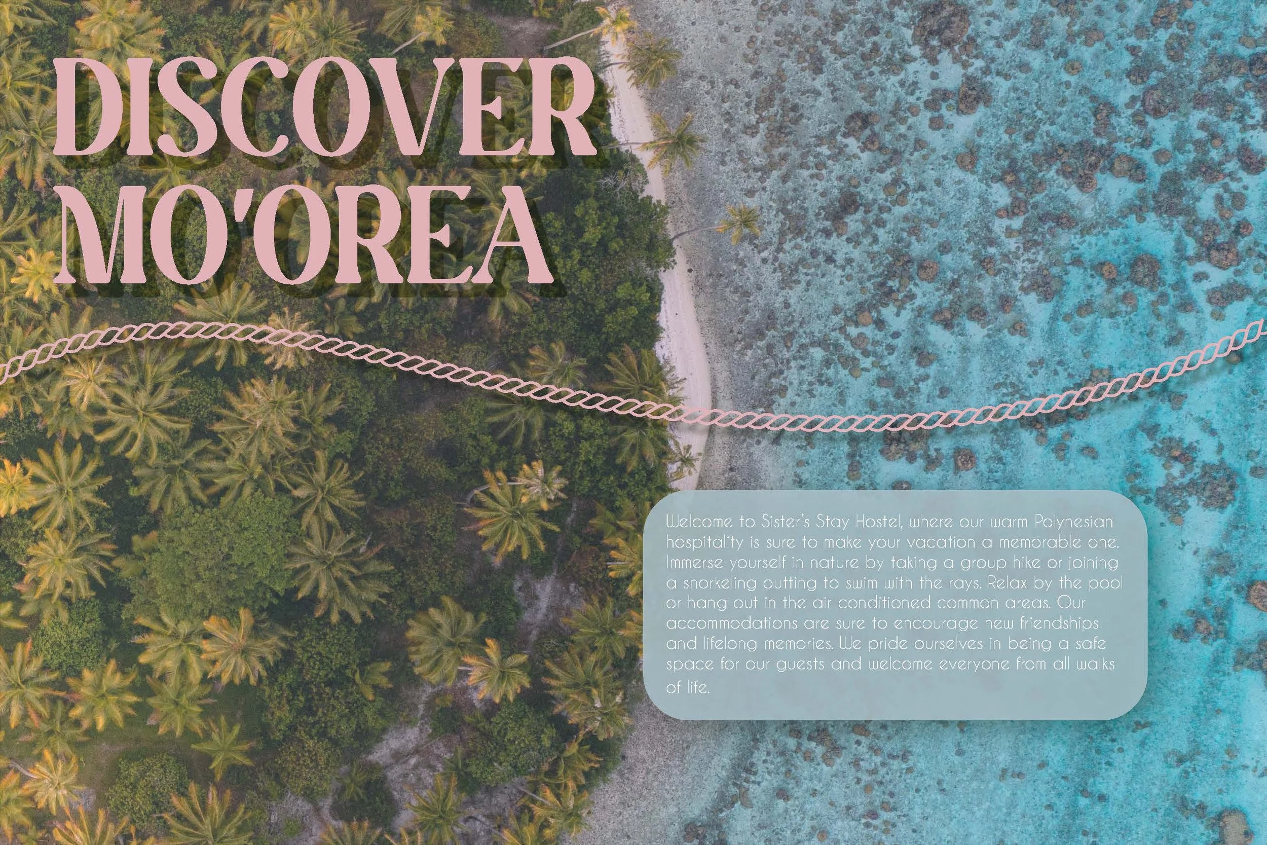
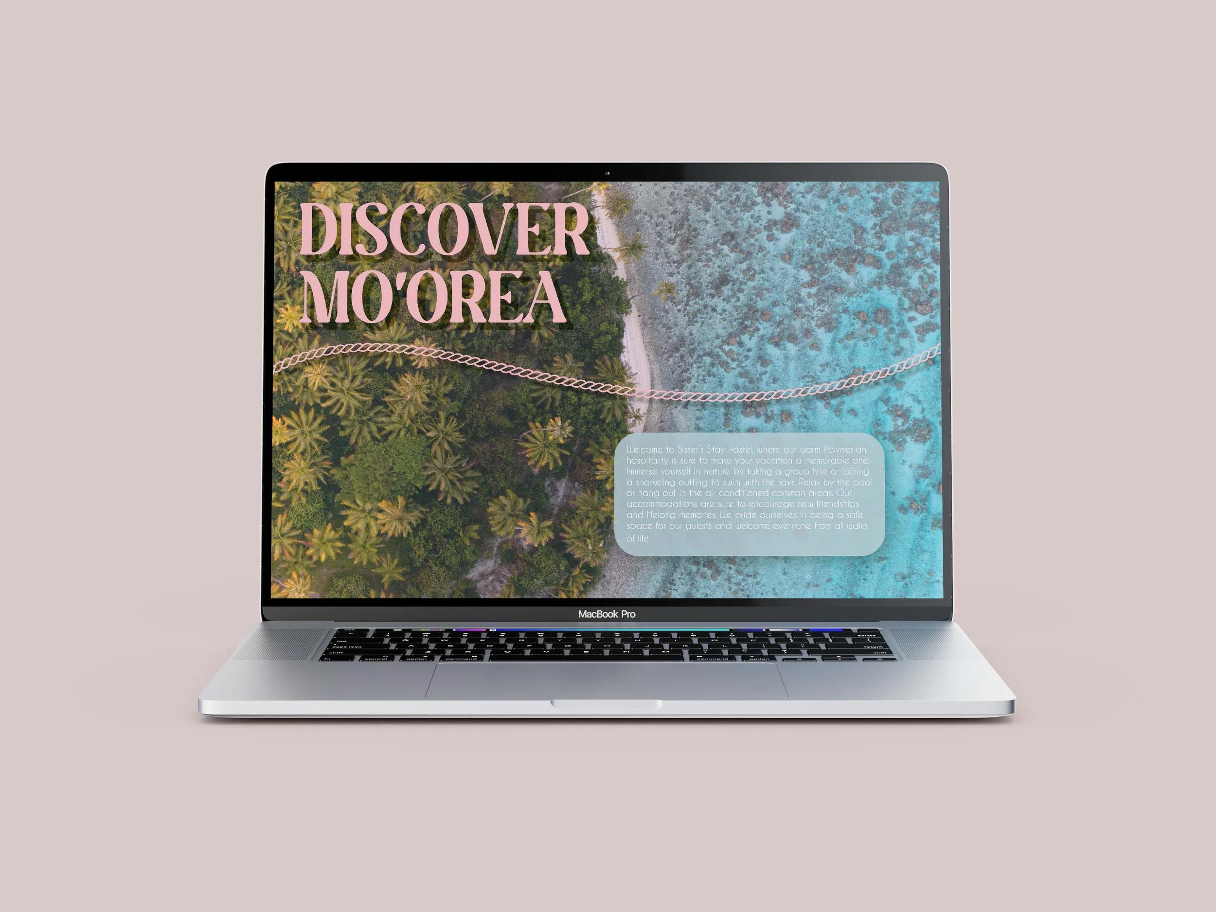
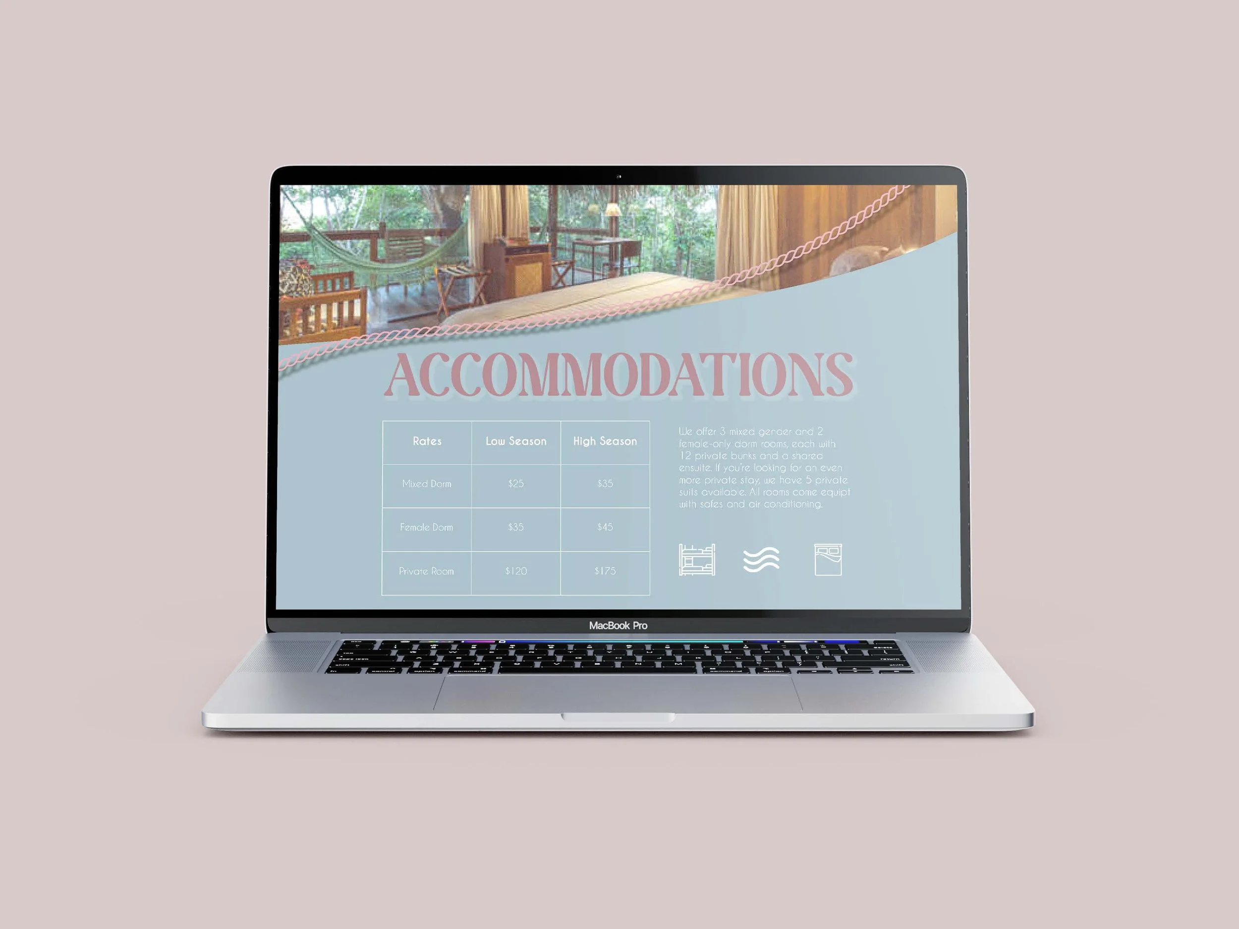
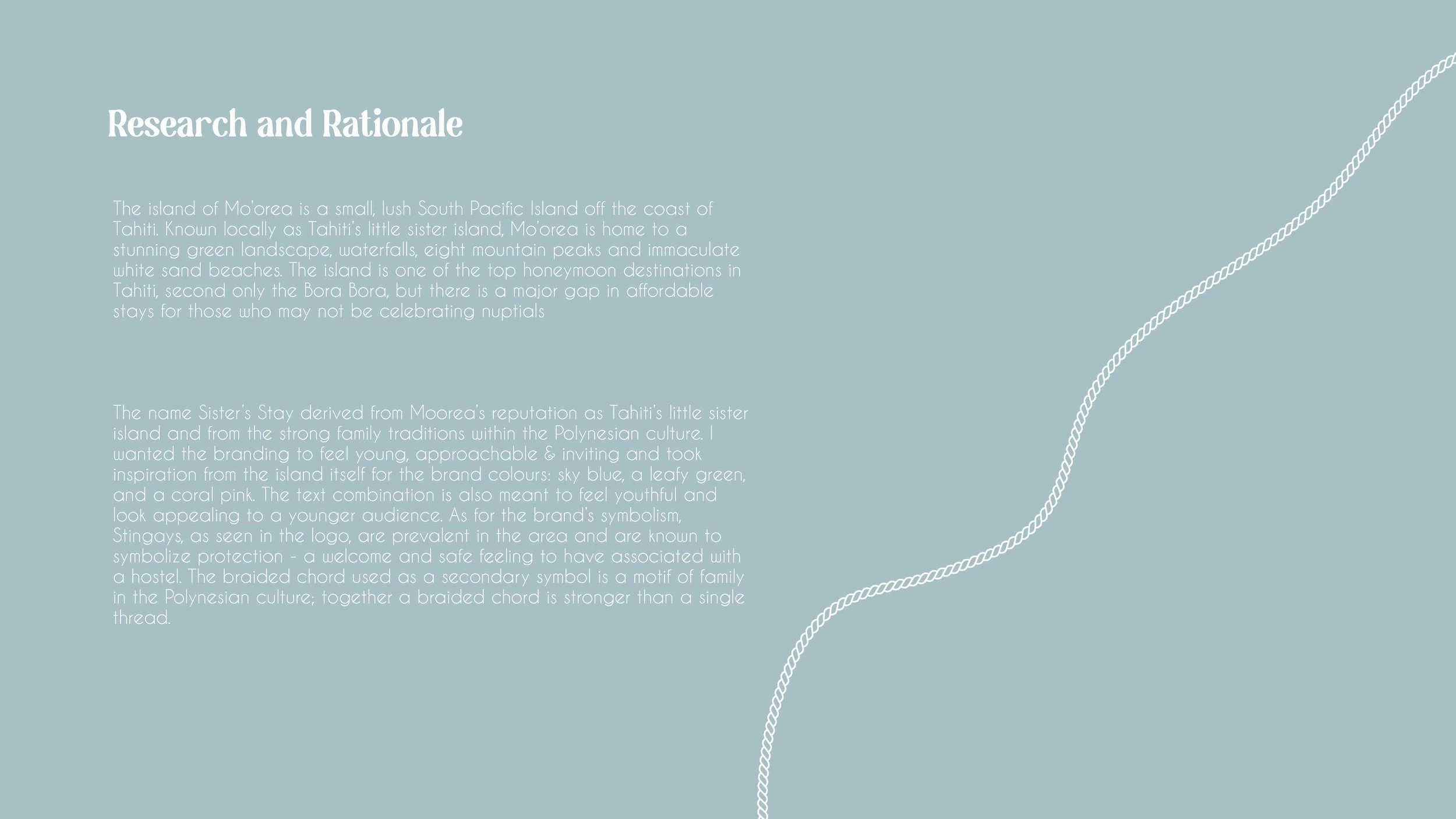
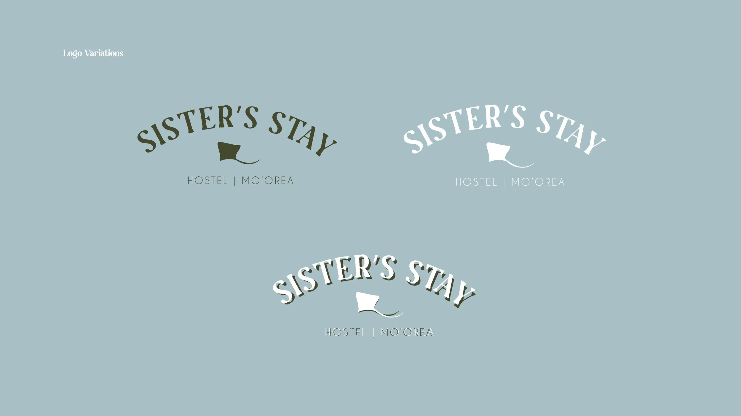
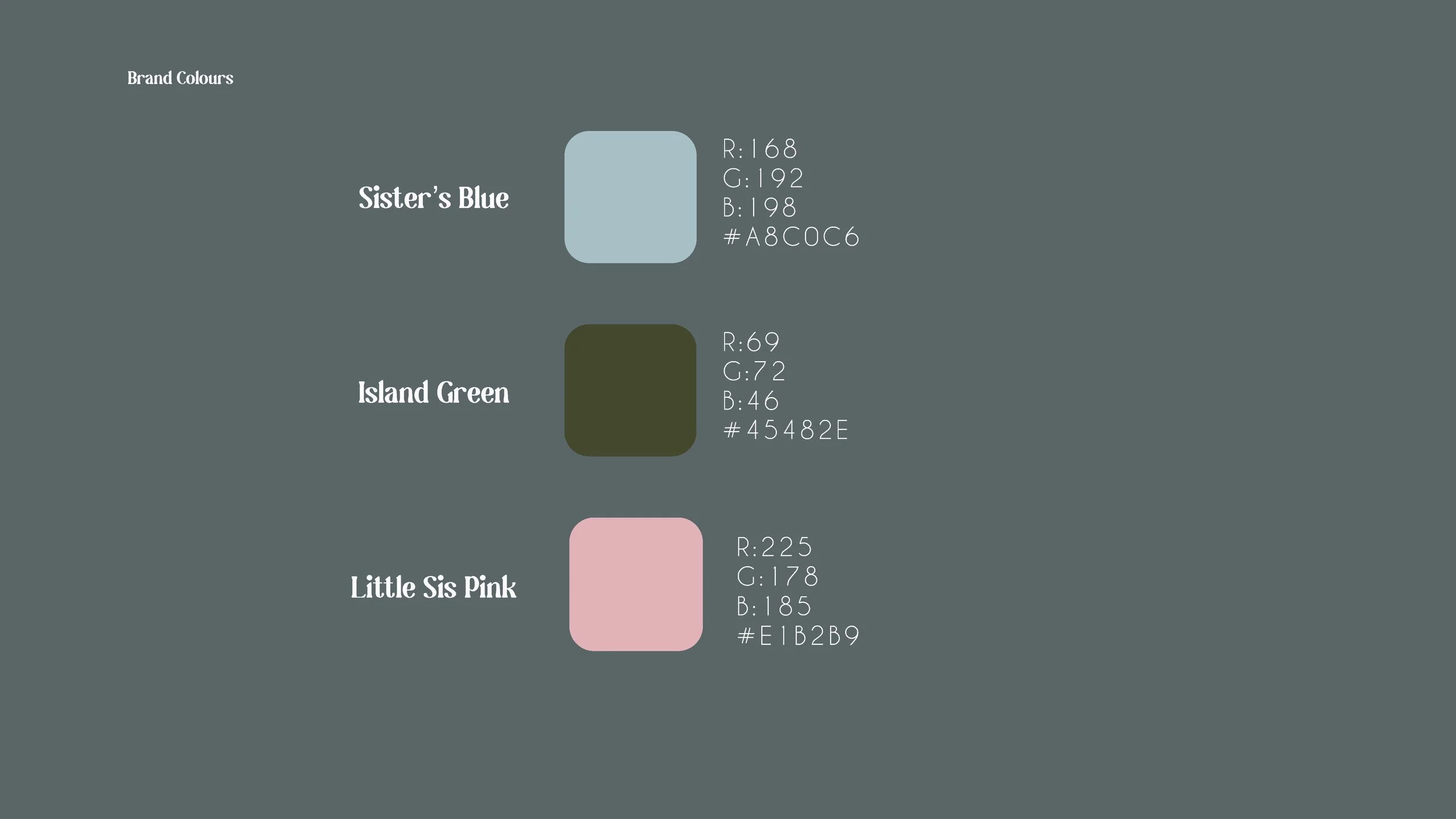
The Design: The name Sister’s Stay derived from Mo’orea’s reputation as Tahiti’s little sister island and from the strong family traditions within the Polynesian culture. I wanted the branding to feel young, approachable & inviting and took inspiration from the island itself for the brand colours: sky blue, a leafy green, and a coral pink. The text combination is also meant to feel youthful and look appealing to a younger audience. As for the brand’s symbolism, Stingrays, as seen in the logo, are prevalent in the area and are known to symbolize protection - a welcome and safe feeling to have associated with a hostel. The braided chord used as a secondary symbol is a motif of family in the Polynesian culture; together a braided chord is stronger than a single thread.